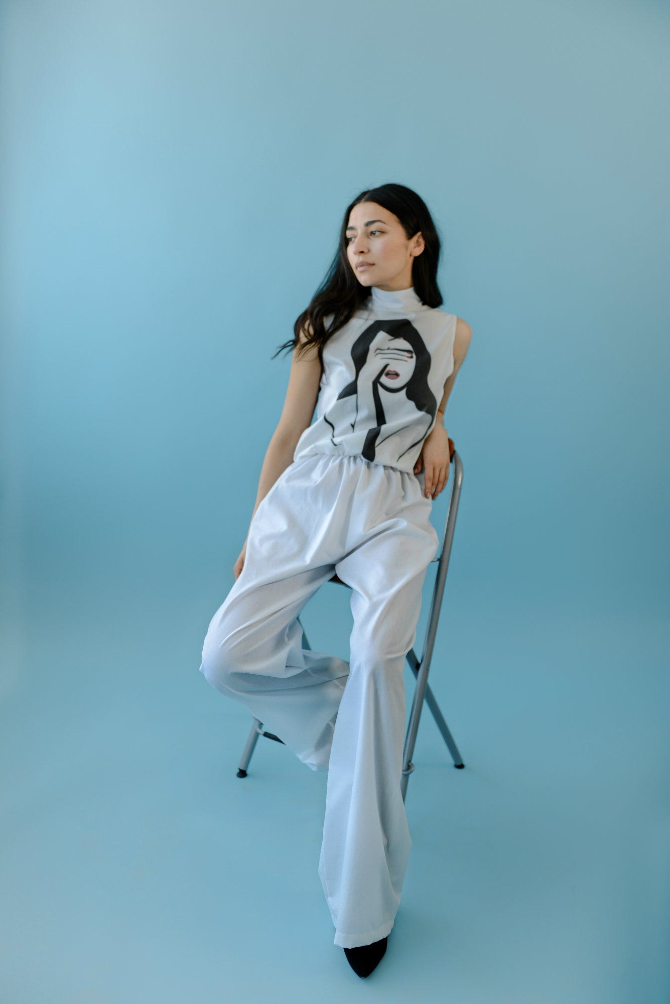
There’s a woman, she’s fearless, she’s strong, she’s outrageously beautiful, independent and unapologetically fierce. She commands the room with her stance and strong will. She’s humble even though she has the power in herself to conquer everything and everyone. Her strength knows no boundaries, her eyes full of wonder and her smile irresistibly charming. No one’s immune to her charisma. This is the kind of woman we’re in awe of, the kind of woman that inspires us daily and the only kind we design for.
Back in February we took you behind our scenes so you can experience our “La Vie En Rose” collection. This April, we’ll be showing you the making of our new collection called “The Mood”. While the first one was inspired by the delicacy of the rose, its fragile petals and its seductive color, this one is inspired by the strength of a woman, her raw beauty and the purity of the color white. Clean cuts dominate throughout the line which mash perfectly with graphic illustrations, designed by the acclaimed graphic designer Monika Zec whose previous work has been featured in the influential publication of Oprah Winfrey, the Oprah magazine.
So let’s start unrevealing the process, shall we…
1. Cuts And Silhouettes
When you open a woman’s wardrobe there are 5 pieces which without a single doubt, every woman has and among them is the white shirt. This item is a staple in every single closet, mostly because it can be paired with everything from jeans to classy pants to skirts and still look super hot. Well, while developing this collection, we wanted to preserve that classiness and translate it into a dress but add a dose of sassiness, so we decided to reinvent the classical take on the white shirt by preserving its shape and strict lines and play around with different lengths, necklines and different sleeve shapes. To get a feel of what we’re talking about check our Pinterest board.
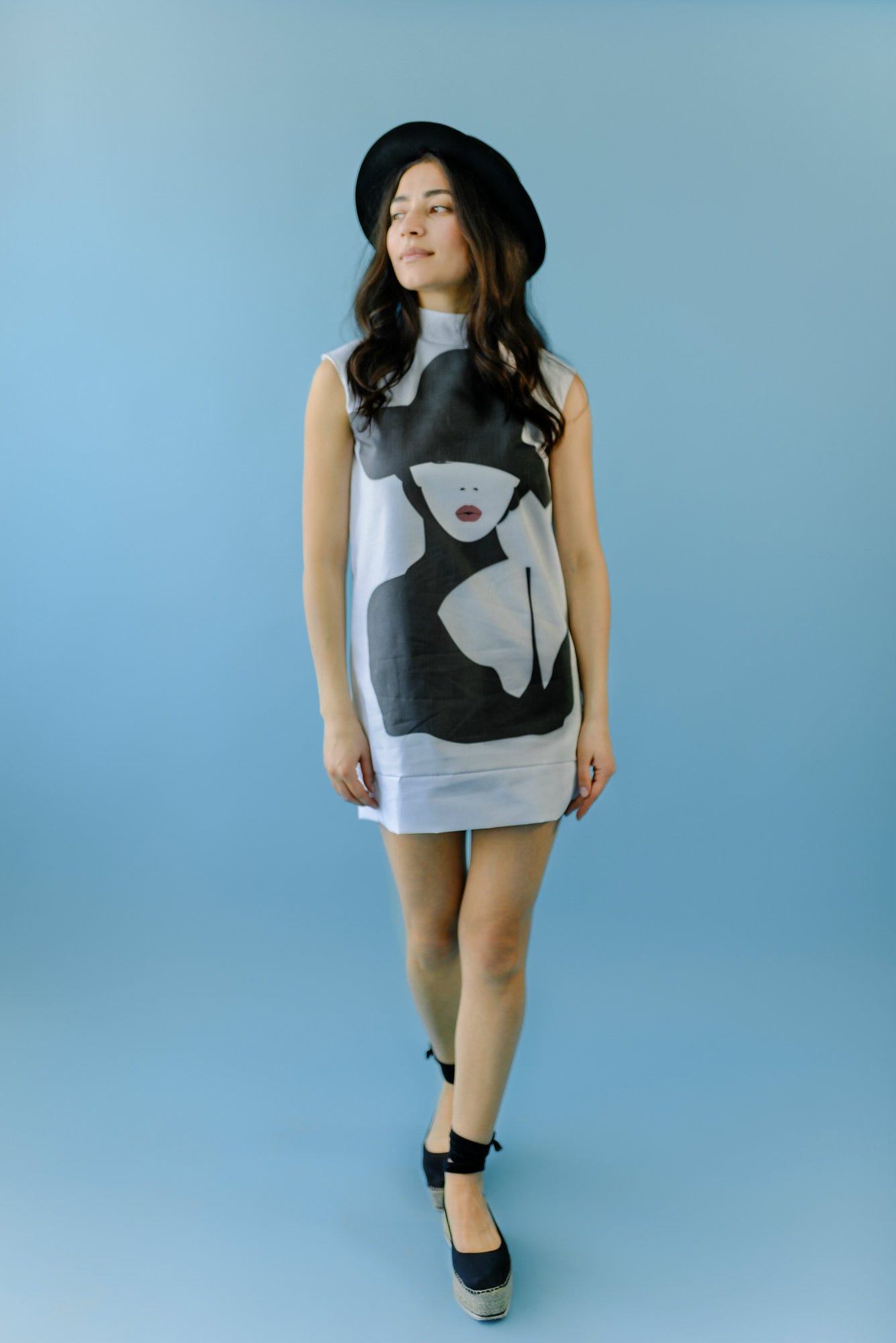
2. The Inspiration Behind The Illustrations
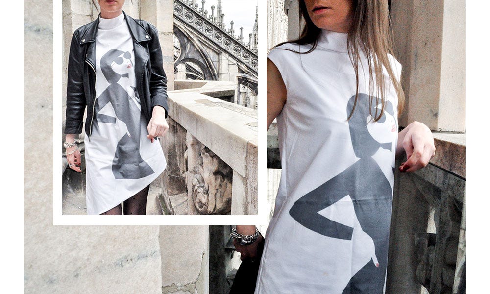
The main idea behind the illustrations was to translate our moods and facial expressions during the working days of the week by creating a casual collection that will be flirty and feminine, but at the same time edgy. This way we could capture both sides that duel within a woman, the soft one and the raw one.

The illustrations are designed by the acclaimed graphic designer Monika Zec
“ I wanted to portray what it’s like to be a confident woman, one who is constantly evolving, learning and enjoying life. I wanted to capture her authenticity and the way she faces and solves everyday problems by just being herself. So with this series of illustrations, I hope I’ve captured her wild spirit, her steel willpower and the way she takes over the world each day of the week.”
—
Monika Zec
3. The Fabric
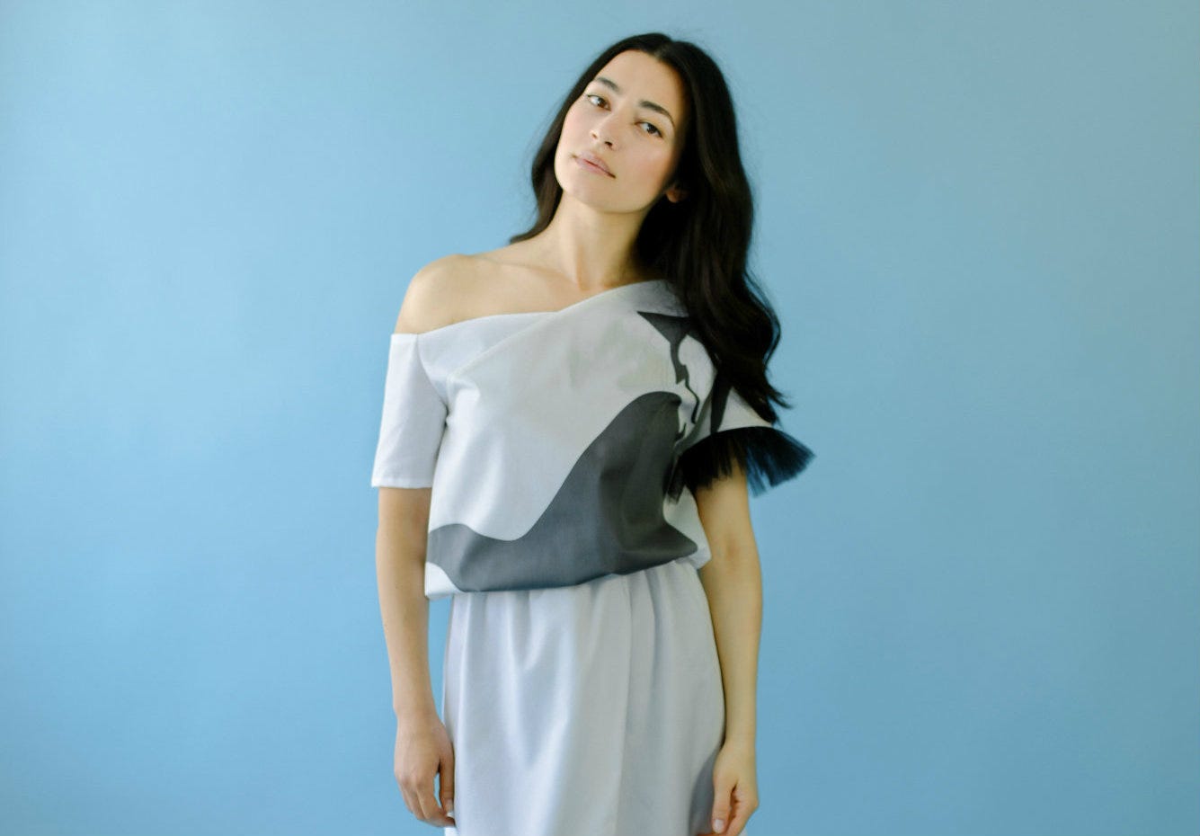
When it came to the fabric we had three things in mind that were absolutely necessary if we wished to achieve the effect we were aiming for. It had to be comfortable, it had to be smooth on touch and it had to be a bit stiff so we could achieve the slick appeal. So we went to the fabric market to look for the perfect cotton fabric and were extremely happy when we found one which had all of the three components we were looking for. Apart from the cotton fabric, we also used a bit of black soft tulle as a detail on some of the designs to add a hint of romance.

4. Hair & Make-Up
As you could have probably seen by now, we like to keep it natural always. Almost every photoshoot, regardless of whether it’s editorial or product photography, we try to keep the make up as minimal as possible. We believe that every woman is her most beautiful self when she’s natural, so that’s why again for this one we’ve opted for nude lips, thick eyebrows and just a touch of a mascara. Hair wise, we’ve decided to go with wavy curves, because hello it’s almost summer and because the model we photoshoot had the most beautiful thick black silky hair.
5. Styling
6. Photoshoot
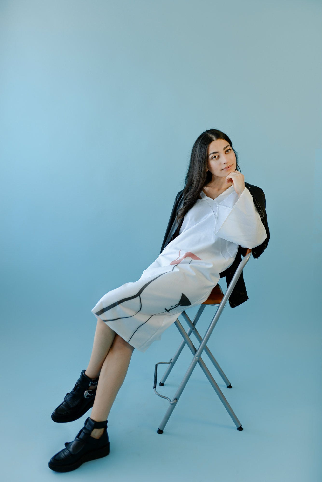
For this collection the product photography set up was extremely simple. We used baby blue background and we only used one stool for several poses. We didn’t want anything else to steal the spotlight from the illustrations, hence the simplicity.
About the editorial and social media photos, we chose the city of Milan and its breathtakingly beautiful Duomo church. We felt that the architecture and the grey background were perfect to capture the spirit of the line.
The developement of this collection started as a way of communicating our feelings about the work days of the week but ended up to be the most exciting, time consuming and interesting collection we’ve ever designed. Made for powerful babes who are not afraid to speak up their minds, it’s a line that celebrates the rebellious, free and wild spirit of a woman. Take a walk on the wild side, why don’t ya?
To view the entire collection, you can click here.


